

Getting over your ex in one emosh campaign.
Eyeballs
Campaign: film and identity
Youtube, Instagram, Netflix Platform
Launch the new Netflix series El Tiempo Que Te Doy
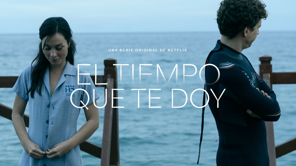
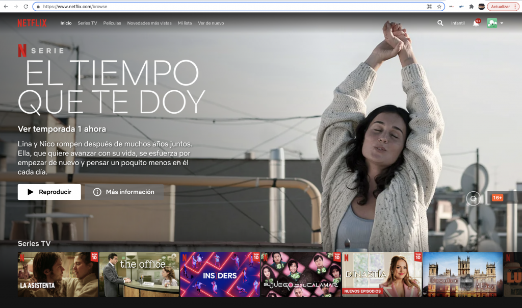
Netflix were due to launch a new mini-series called El Tiempo Que Te Doy (The Time It Takes) and needed marketing material. That’s where we came in. The new format was an exciting 11 episode long series, where each episode lasts only 11 minutes. The storyline follows Lina (Nadia de Santiago) getting over her ex Nico (Álvaro Cervantes). The first episode dedicated 10 minutes to the past, and only 1 to the present, but with each instalment one minute less was spent in the past, and one more in the present.
Our strategy revolved around time, and how it can heal everything. We used various visual techniques to demonstrate this passing of time, and focused on being happy on your own.
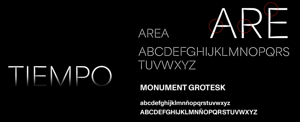
We developed and produced 4 different audiovisual pieces for various moments during the campaign, as well as the title treatment for the series which was used across various other touching touchpoints of the campaign.
